Kitchen Refresh
When thinking about home improvements, there are few things more impactful than a full kitchen remodel. Gutting a kitchen provides an opportunity to improve design flaws in the kitchen and make the whole house more functional and beautiful. However, in some homes, the kitchen may be functional but dated. In these instances, a kitchen 'refresh' can update and brighten the kitchen without the time and expense of tearing everything out and starting fresh.
Orinda Downs
Wow, what a difference painting the cabinets white, replacing the back splashes and opening up the skylight in the middle of the room made! The polished granite counters were honed to a matte black to bring a more contemporary look.
Before
After
In the family room off the kitchen, the fireplace was transformed by removing the raised hearth, replacing the brick surround with granite and a white wood mantle and making room for a large screen TV above the fireplace. The room got considerably brighter when a 6 ft sliding door was replaced with a 8 ft sliding door. New paint and refinished wood floors finished the makeover. Furniture and styling by Mary Anne Pickett of Classic Casual Homes.
Before
After
It's difficult to tell that this is the same space! The eating area off the kitchen became one of the favorite spots in the house when the bench seat, built in book shelves and bead board were added. The 'wow' factor increased definitively when the sky light was opened up, the beam stained a walnut color and a new light fixture was installed to complete the Napa farmhouse feel. Furniture and styling by Mary Anne Pickett of Classic Casual Homes.
Before
After
After
Sleepy Hollow
Almost 20 years since this kitchen was built, the cabinets and appliances were still in good shape and the kitchen was very functional! Functionality aside, the 'old world' mosaic back splash, speckled granite counters and the red island and gold walls dated the kitchen. Painted cabinets (BM 50% Revere pewter), white walls (BM OC-17), new back splashes and Calacatta marble counters brightened and refreshed this kitchen.
Notice the mini-cabinet remodel around the cook top. The corbels and pillars on either side of the stove were replaced with cabinets that visually support the hood. The cabinets not only hide the coffee maker but also add a place to keep cooking oils and spices close by but hidden.
Before
After
The red island was re-painted with a very dark 'British racing' green color to provide visual impact while also complementing the outdoor views. The wood floors were re-finished to a dark walnut to contrast with the lighter perimeter cabinets.
Before
After
Before
After
Orinda Country Club Refresh
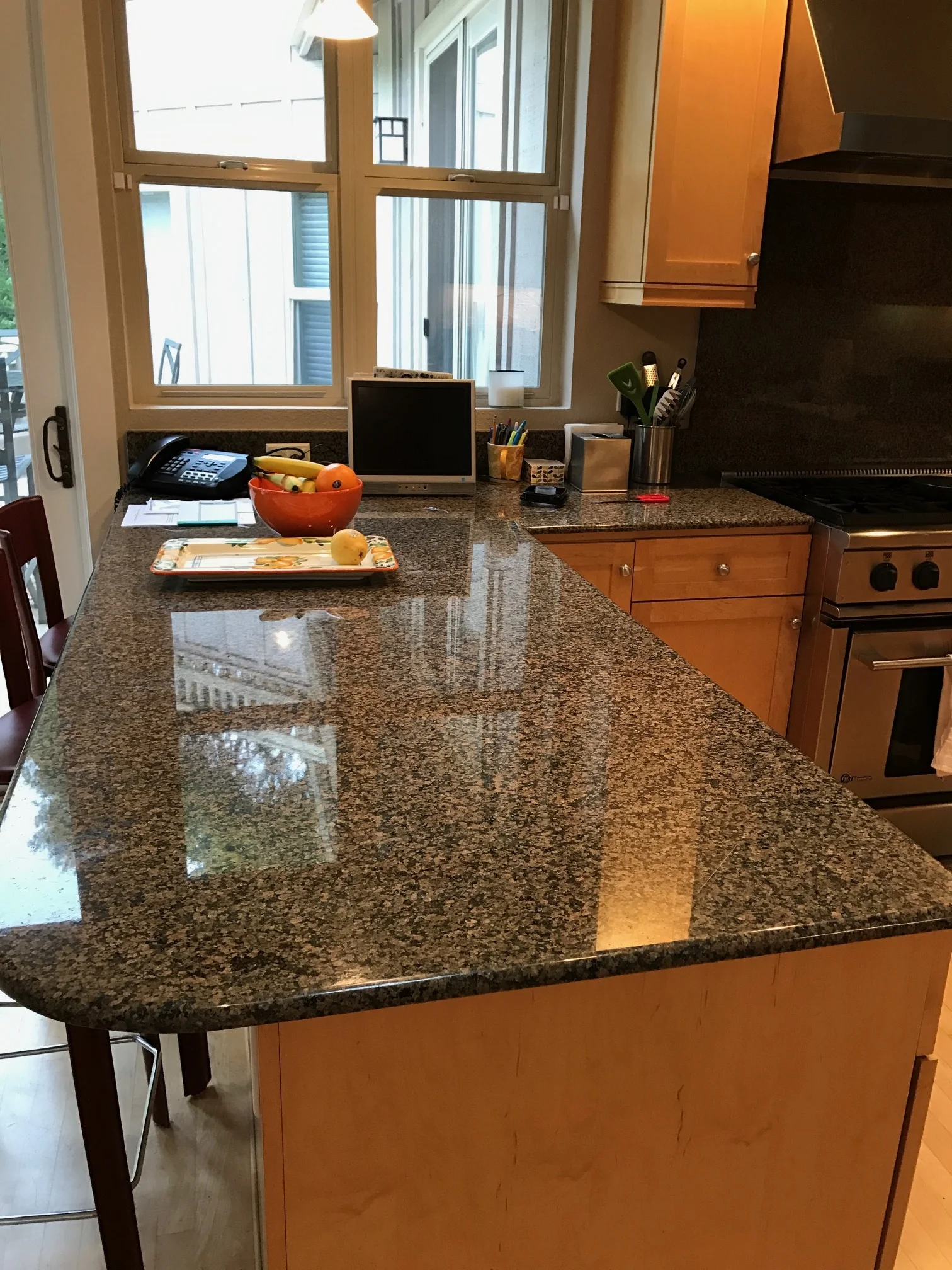
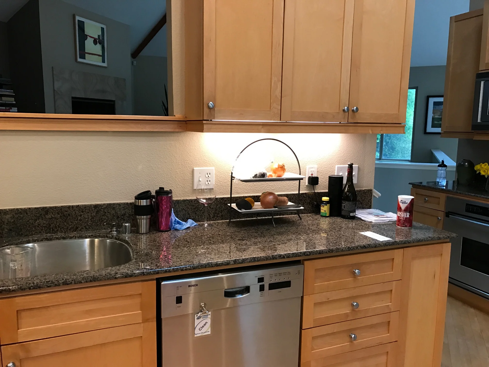
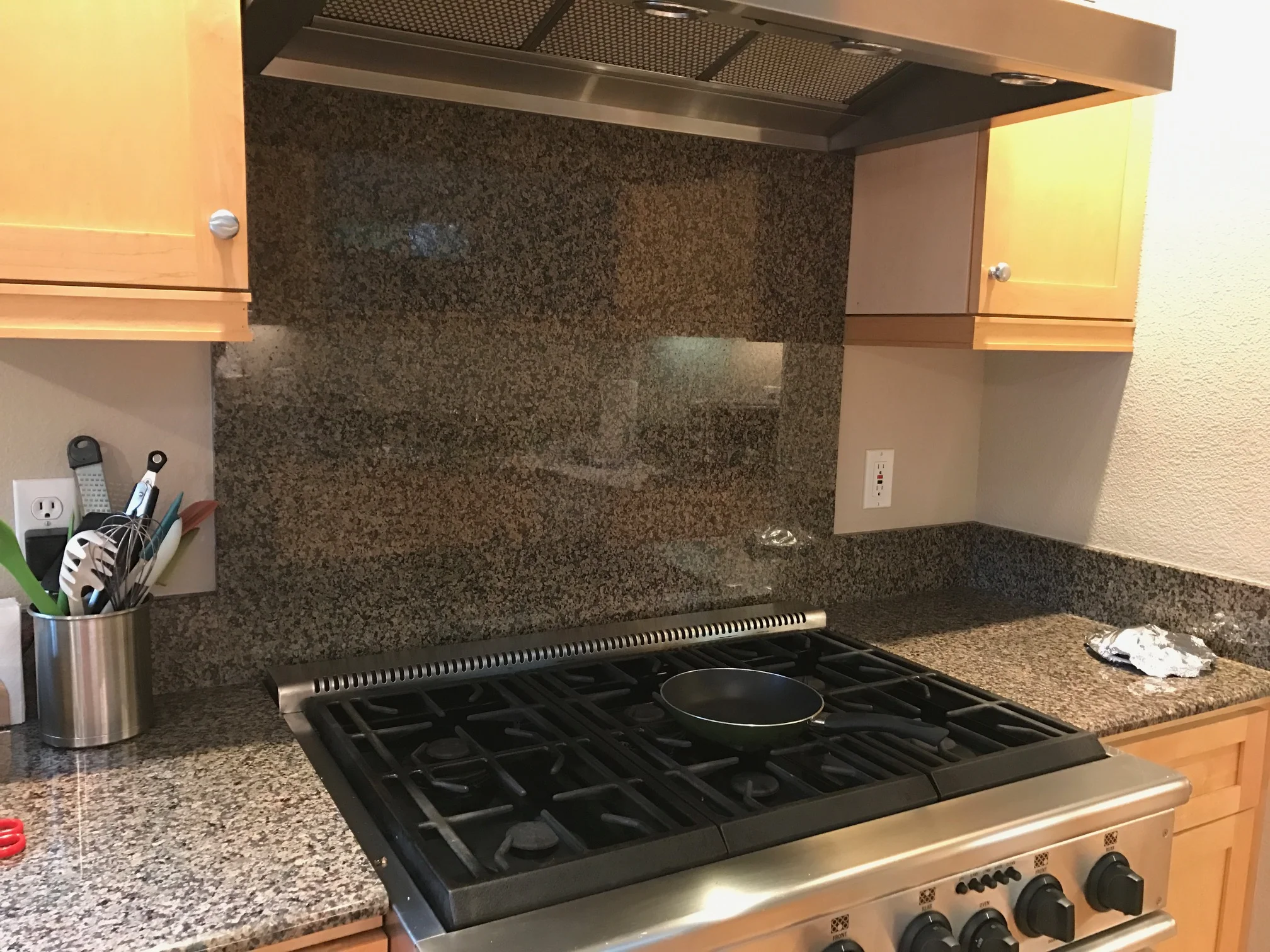
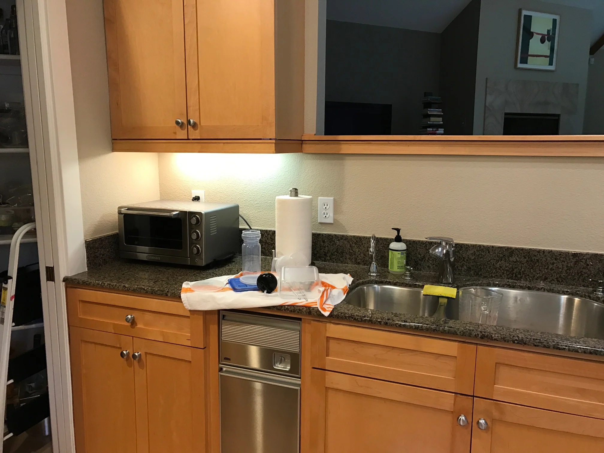
Having lived in their kitchen for almost 20 years, these homeowners were tired of the maple cabinets and granite counters but they didn't want the expense and hassle of a complete kitchen gut.
The cabinets were painted a very light grey, the counters got a refreshed with Zodiaq London Sky quartz, the maple floors were stained dark grey and a glossy white brick tile back splash was installed. New plumbing fixtures, glass pendants and cabinet hardware completed the transformation. You can hardly tell it's the same kitchen!
Furniture and styling by Mary Anne Pickett of Classic Casual Homes.
Before
After
Before
After
Before
Before
After
After
After
After


